Infographic Case Tray
Art Direct/Designer - Silver Branch Brewing Company - Branded case tray - 3 weeks
CHALLENGE
Packaged beer sales were slowing in craft bottle shops, so the company decided to drive revenue by engaging consumers on their wholesale case trays.
GOAL
Design branded case tray support wholesale revenue growth
USER DISCOVERY
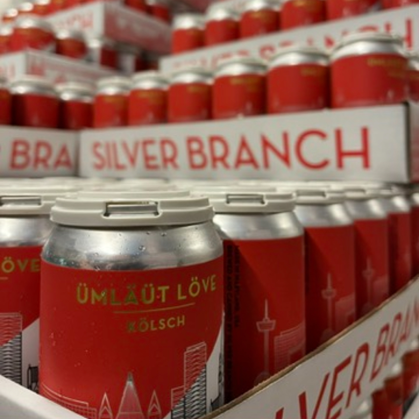
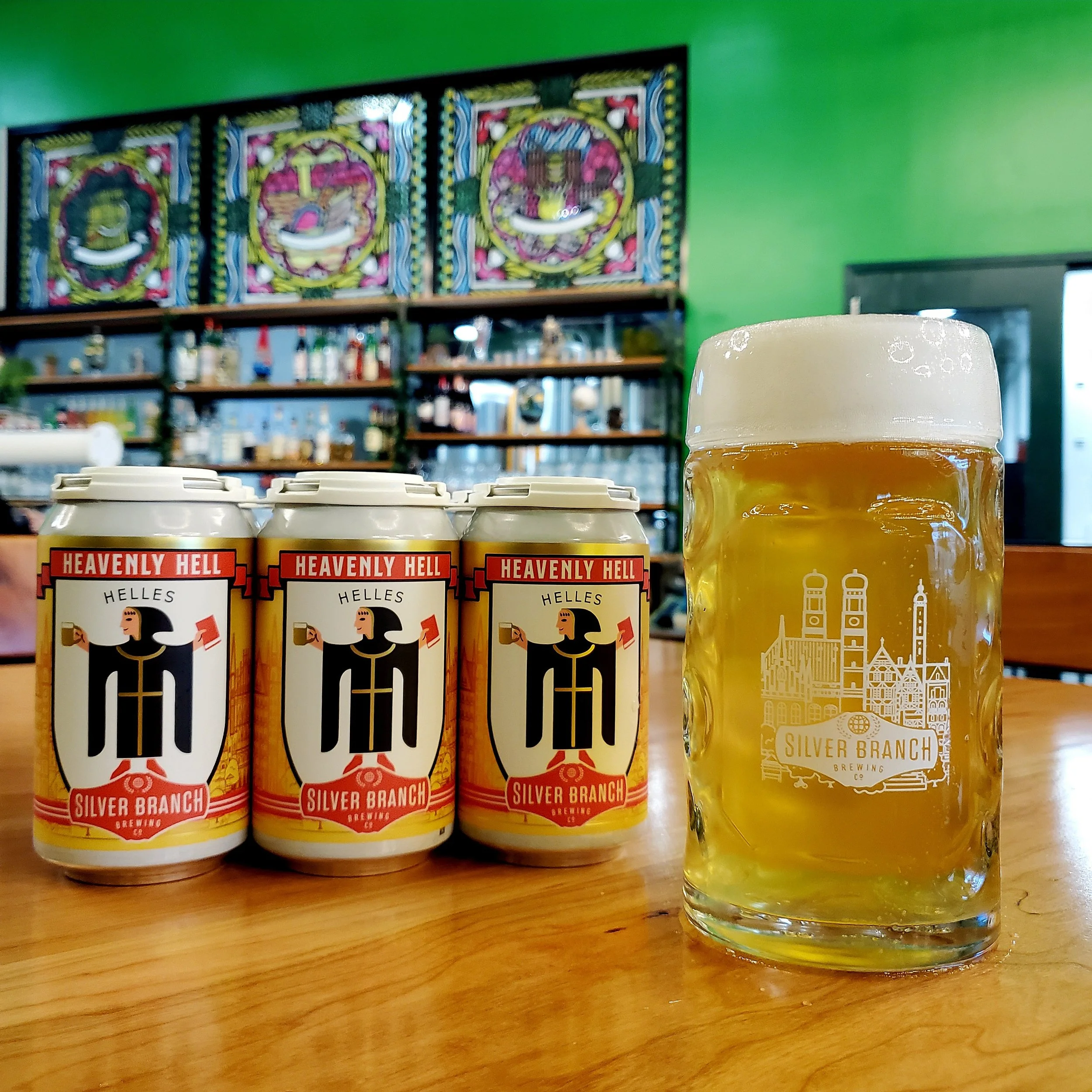
WHAT IS THE BRAND? Silver Branch Brewing is a craft beer producer that draws inspiration from international and historical brewing techniques. The branding takes a page from Randy Mosher’s book “Tasting Beer” and organizes styles into “four brewing cultures”— Central Europe, British Isles, Belgium, and the Americas. These geography-based brand lines inform the packaging and advertising design.
WHO ARE THE USERS? In the context of a case tray, the users tend to be the brewery’s wholesale customers at small craft beer and bottle shops in the DC area, rather than consumers of the products.
WHAT DO THEY NEED? Beer and wine shops need to clearly understand the diversity of products being offered so they can make smart buying decisions on behalf of their customers.
WHAT DO THEY AVOID? Wholesale beer buyers at craft bottle shops hate being confused about new products. When they are unclear of what is being offered, they tend to stick to familiar products. For a brewery, this can lead to stagnation and ultimately a loss of shelfspace to competitors who are growing their brands.
USER INSIGHTS
Beer buyers are more likely to add new products when they have a clear understanding of what is being offered and how it fits into their overall strategy
DESIGN STRATEGY - A successful design will entertain, educate, and inspire wholesale customers, leading to greater brand awareness and increased sales.
What entertains a beer buyer? They enjoy sharing their passion.
How do you educate a craft beer expert? Presenting information in a clear and intuitive way helps the user make new connections about familiar styles.
Why are they inspired to buy this brand? Beer buyers want to be positioned as experts and ally themselves with professionals. Promoting mutual expertise creates an opportunity for the seller to demonstrate knowledge and promote the brewery.
CONCEPT IDEATION
Comics about brand characters - Fun! Playful! Brand positive! Also expensive to produce and doesn’t display the most useful information to the intended user in a convenient way
List of beer facts based products - Educational and interesting, however the abundance of information is unlikely to make the full scope of products more comprehensible
Checklist of product lines - Serves a sales goal, but will anyone use it? The large size is too unwieldy for a functional checklist
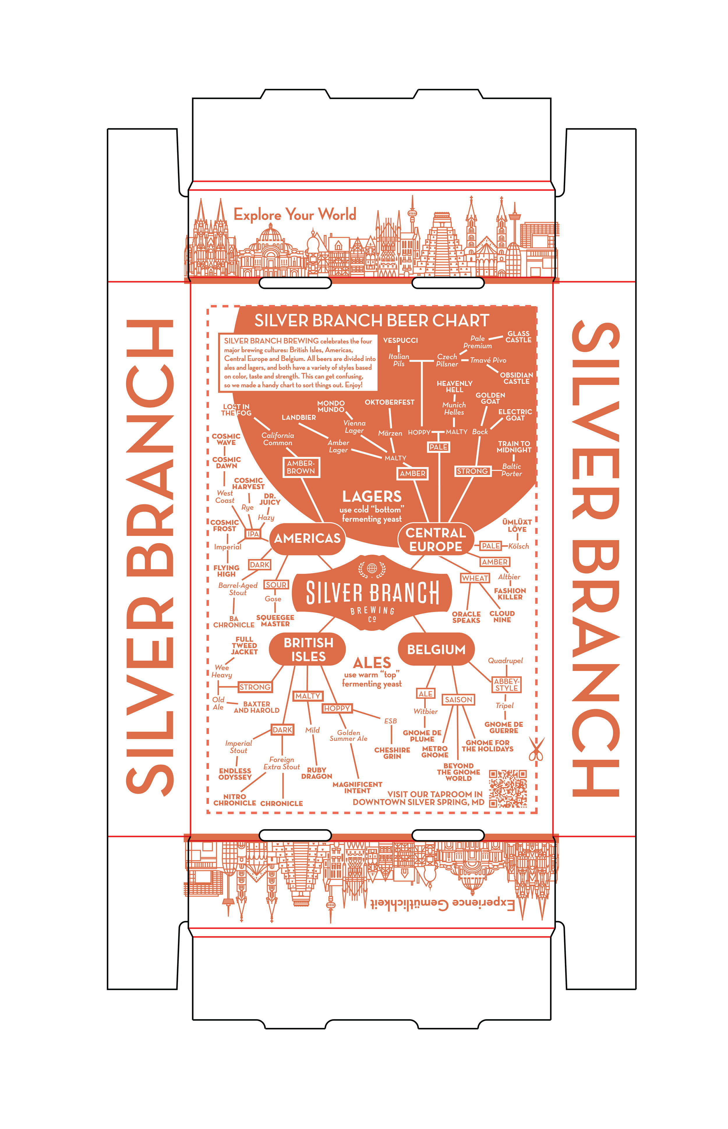
Infographic of global beer styles - Perfect! It draws on the company’s internationally-inspired beer menu, is interesting to beer nerds, shares industry knowledge, and helps the user understand the brewery’s list of offerings in unique way
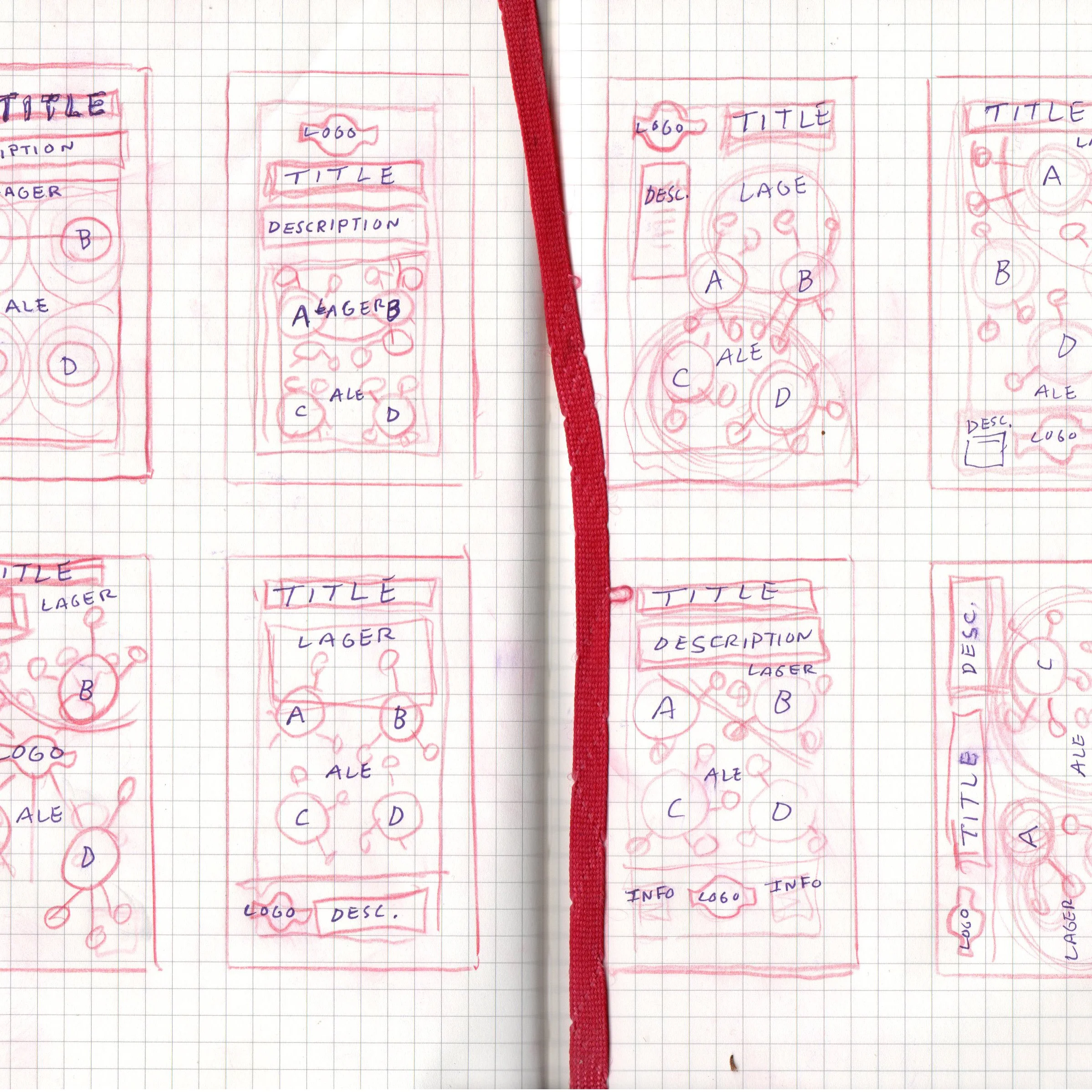
VISUAL DEVELOPMENT
Before I devised a solution, I needed to address technical and brand considerations. Case trays are printed using a Flexoprinting process, which relies on a laser-etched rubber wheel to continuously print high volume materials. The process requires that lines are no smaller than 2 points wide, so the typography needed to be mindful of font size. The company style guide recommended Nutraface Bold and Book and the project budget allowed for a single brand color, Antique Red.
DESIGN RESEARCH
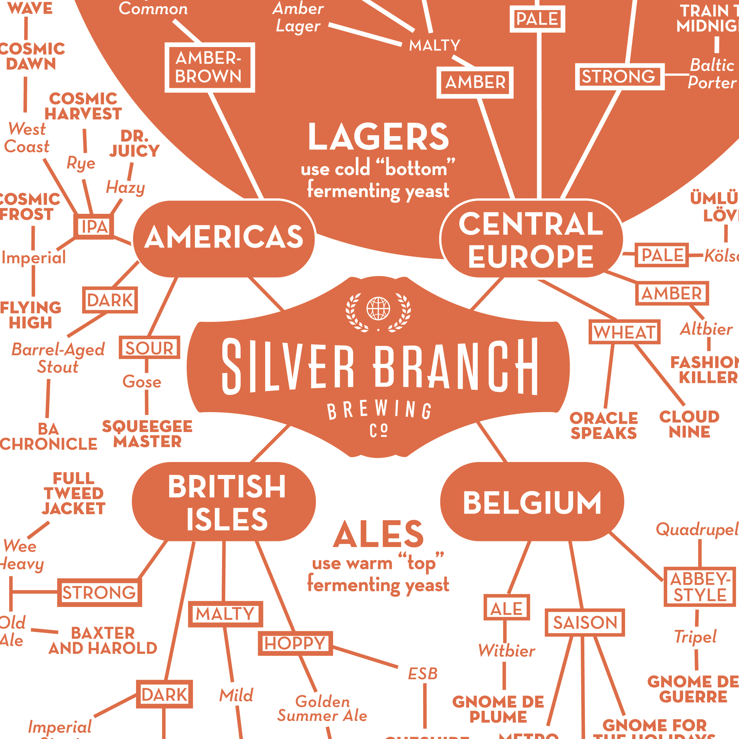
Framing the chart of beer international styles into the four brewing cultures (Central Europe, British Isles, Belgium, and the Americas) connects directly to the brewery’s core brand. Organizing the multitude of overlapping recipes and techniques is a much more indirect process, and brewers have argued over these designations for decades. The Beer Judge Certification Program (BJCP) handbook is the best resource for settling this issue. This guide presents a robust system of beer categorization that includes yeast, grist, color, strength, and place of origin.
SOLUTION
Given the derivative nature of beer styles, a branching chart conveys the narrative and accommodates the BJCP’s data format. The information is divided into the brand’s four major brewing cultures with two zones, lagers and ales. For every cultural branch, the styles are sorted by color, taste, and strength. Each style is connected to a product. If buyers are seeking a Central European-style pale, hoppy Italian Pilsner, they know to order Vespucci.
The hierarchy is bolstered by font size, weight, and capitalization.
PROTOTYPING
I created mockups of the case tray with three questions in mind:
Does it engage the user?
Is the information clearly understood?
What actions are taken in response to the design?
KEY STAKEHOLDERS
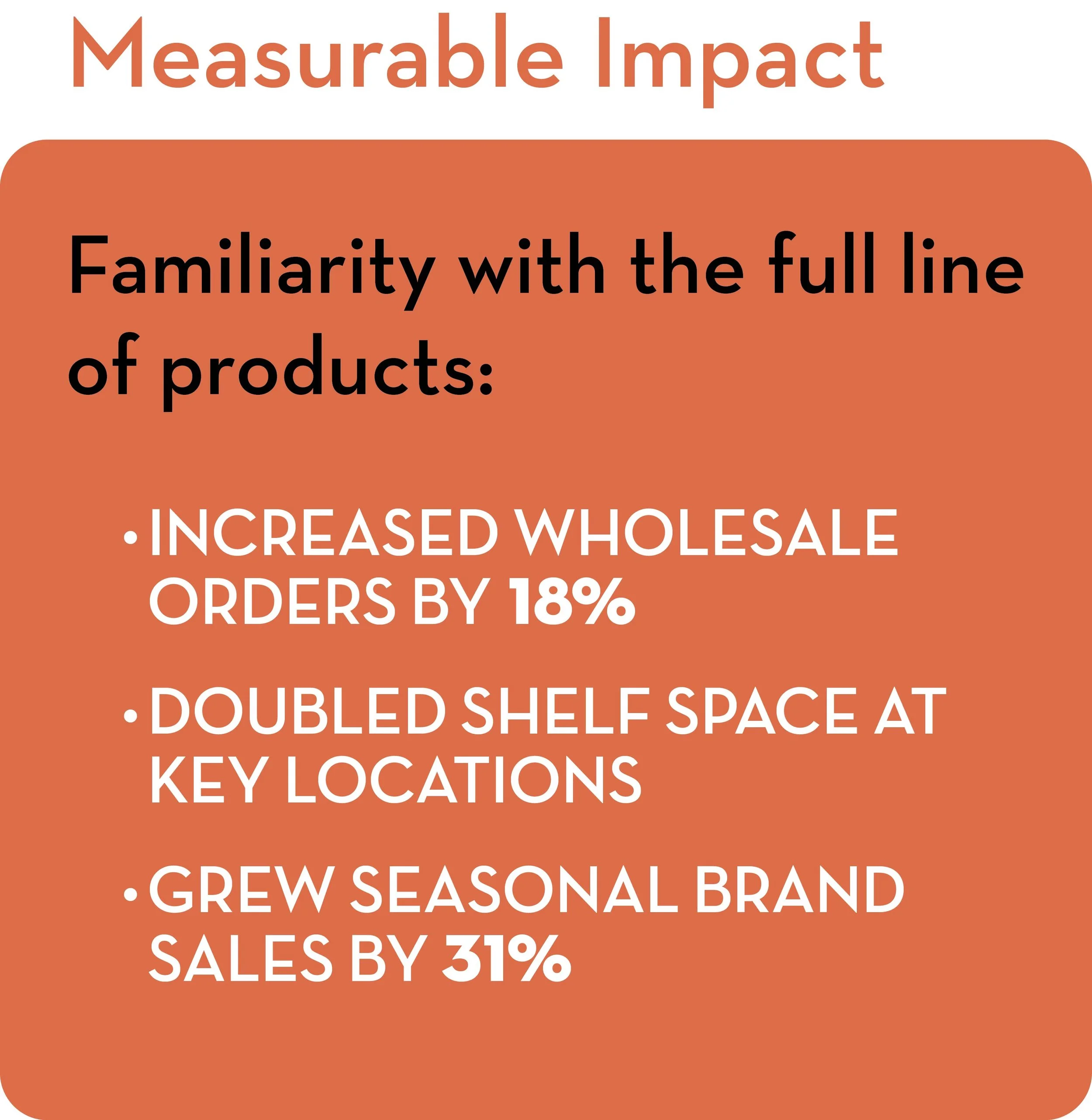
Beer Buyers were surprised and delighted when they discovered the infographic on the bottom of the case tray. They followed the logic of the hierarchy without issue, and many learned new facts from the graphic. 75% of beer buyers said the chart would help them order a wider variety of products.
Sales Reps were thrilled by the format of the information, which easily directs them to the appropriate products based on a customer’s interests and needs. Over half of the reps said the chart will enable them to speak more confidently about lesser known styles and sell a broader range of products.
Members/Investors are enthusiastic promoters of the company’s international beer culture branding. They loved checking the infographic against their knowledge of the BJCP style guide. They found the information to be clear, accurate, and interesting.
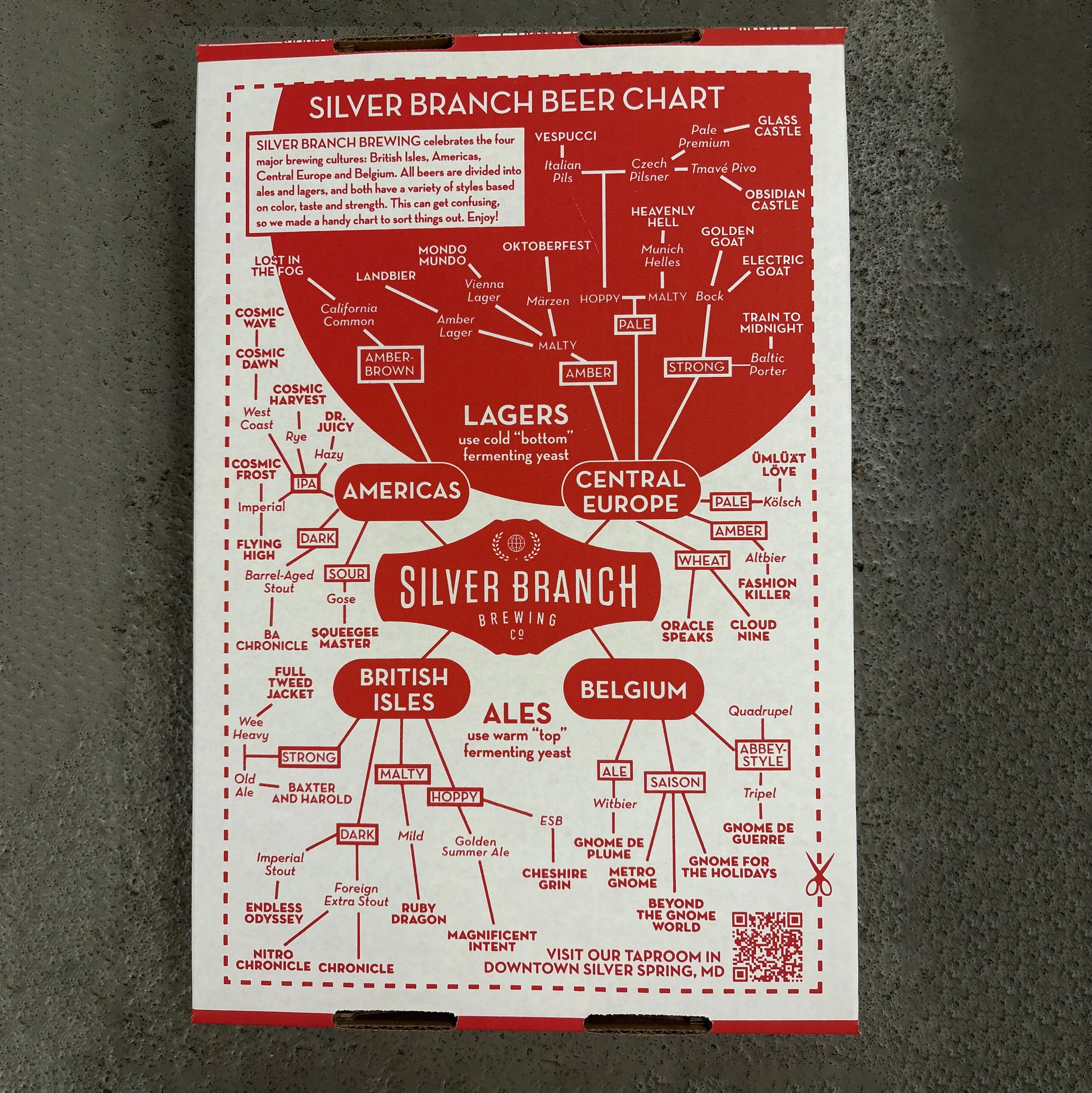
IMPROVEMENTS - Nearly a third of the key stakeholders asked for the products to include the percentage of alcohol by volume. Many of the investors suggested including a QR code to drive customers to the taproom.

DELIVERABLES
Branded case tray and sales one-sheet featuring a craft beer infographic that increases awareness of the brewery’s full scope of products.